 |
| I like this harry potter cover as it is so well known that the magazine had little to do to advertise it. The lighting here is dark and the direct look in to the camera means he has power. I will take the fact that there is a central figure and add it to my front cover. |
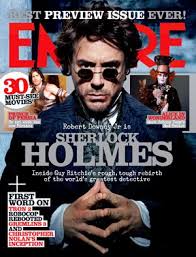 |
| I like the fact that the title is behind the figures head. I also like the way that other characters are popping out the magazine. The lighting here shows that he is good and the slightly low angle shows he has power. I will use the title behind the head in my poster |
 |
| I like how this poster only follows a strict colour scheme. I how the background shows us where the action is taking place. I also like the extravagance of the costume as this is key identifier to what the movie will be about. As my movie is horror orientated, I will use black, white, red and grey as my colourscheme. |
 |
| I like the power implied by the character as he is using a broad stance. The use of Photoshop to make the poster behind look old and tatty is effective as the story is set during the 40s. I particularly like the bold headline and will use this is my magazine. |
 |
| This poster is more indicative of the type of image I want to aim for. I like the smokey effect of the writing and the use of other picture across the bottom of the page. I will use the bar code, the other pictures and a similar colour scheme in my work. |
No comments:
Post a Comment