Wednesday, 1 May 2013

More Evaluation

Below is some more evaluation including where I got my inspiration from.


Tuesday, 23 April 2013

Evaluation

In what ways does your media product use, develop or challenge forms and conventions of real media products?


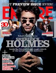
After doing some thorough research in to the field of music videos, I decided to change my project to creating a horror movie trailer. This, for me, was a choice I made in order to challenge myself and to create something different.


Trailer
Use-
Plot- I also researched the types of horror movies I could have made.  Charles Derry believes there are only three categories and out of these 3, my trailer relates more to Human Monsters but upon further research, I realised it related more to a slasher movie. I made this clear in my trailer by showing a screen shot of a dripping knife. This has connotations of blood and gore and death and I felt this would be good in providing authenticity in my piece.
Camera-I began by researching horror movie trailers and found that there was a general pattern in the sense that the beginning of the story is told in the first minute and then the trailer will dissolve in to a montage of footage. I used the ending of my trailer to show the montage editing that is typical of all horror trailers.
Lighting- I found that most horror trailers feature elements of both darkness and lightness. The light is often found at the beginning of a trailer whereas the darker elements seem to occur towards the end of the trailer. I chose to emulate this as I felt it was important to create the right kind of balance. I found it a little tricky to film in the dark without proper lighting as this often leaves the subject on in the dark. 
Sound- For sound, I chose not to use a boom pole as I felt this would be difficult to hold whilst filming. I found that the camera picked up enough audio for what I wanted anyway. As for a soundtrack, I used a song which is typical in horror movies.  It creates and sustain suspense and left me feeling creeped out and so I put it in my trailer.
Editing- A typical edit of horror movies is to use montage editing. This is when shots are put next to each other in quick succession often featuring fade to blacks. These are effective in delivering scary moments and often leave the plot a bit ambiguous. This will then encourage the audience to watch the film. 
Location- I researched the conventions of horror movies and found that they are designed to install fear and panic, capture the audience and have a major plot twist or scary ending. I incorporated this in to my trailer by playing on the fears that everyone has.  I set it in a school as everyone goes through school and so my trailer is subtly saying that it could happen to anyone. I chose to do this as I had easy access to the location and the actors are of school age.
Actors/ Characters – I chose to stick the conventions of horror movie actors and use people that are unknown. They do this as they are cheap to hire and more money needs to be spent on effects and location to provide a realistic story. My researched led me to find four main types of character which are the hero, the best friend, the crush and the killer. Most of these can be found in all horror movies and in general, the subplots explored in horror movies are related to sex, friendship, money and revenge which I tried to show in my piece.  

Develop-
Plot-  After researching a lot of movies, I found that many of them centre of high school children. Many of them also focus on the past. Ultimately, I felt that the combination of the two provided a unique and attention grabbing story line which the market had a gap for.  I did this by combining the present day lives of teenagers and their childhood and how an accident in the past left them all feeling damaged and how the secrets are coming back to haunt them. It is a typical plot but is set in a different setting.
Camera- I chose not to use a tripod and rather use my hands alone. This way I can gain the angles I wanted as I felt that I would be limited with a tripod.  I also experimented with the different styles of shooting including changing the iris exposure on the camera. I also shot several different examples of one shot in order to have a range of material.
Lighting- I chose to do most of my shooting in the daytime as I felt this would look more realistic as the setting is within a school.  It was also convenient to shoot during these times as I had access to the location.
Sound- I chose not to use audition for sound effects but rather film them using a camera and then separate the audio from the footage.  I also used a voice over which was supposed to sound like it came from another clip.
Location-  I developed my location by using  a school instead of a haunted house, a cabin in the woods or an abandoned fair ground.  I felt there was a gap in the market for a school based horror movie and felt this would relate to my target audience.
Editing-  I tended to use jump cuts which are typical of movies in general but I also chose to place a series of quickly edited shots at the beginning with the nursery rhyme “ring around the roses”. I extracted the audio from one of my clips and then placed it on top of the action for the first couple of shots. I felt this was key in getting the audiences attention.

Challenge-
Plot-   My plot follows the general rule of horror movies in the fact that the action happens in the first minute. I challenged myself to write an interesting and unique story. The most challenging part of the process was trying to create a new story.  Whereas many people emulated certain famous movies and added their own twists, I used elements from all kinds of films (hide and seek, sorority row, detention) and created a simplistic plot.  I found it challenging trying to make a trailer when the whole story hasn’t been filmed.

Camera-    I felt that I didn’t challenge my camera skills. I would say I had developed more though. I now know how to create a better exposure and change the lightness of the camera.
Lighting- instead of shooting primarily in the dark, I shot mainly in the light as I felt it would be scarier. The thought that it could happen to you anytime, any day and anyplace is very scary.
Sound- I stuck to the general conventions when it comes to music, if I had done more research than I could possibly have challenged some conventions.
Location- I challenged some conventions and choose not to represent any figures of power, that are typical in horror movies. Often funny horror movies feature people in power being killed in funny ways. 


 How effective is the combination of your main product and ancillary texts?


 What have you learned from your audience feedback?

"I'm impressed. The only problem is that some of the sound and volume aren't the same. One moment, its really loud, and then in other moments, it's quite quiet." Lynne Lorraine-Francis

"I like the balance of male and female characters. Some movies only have girls or boys but this trailer could indicate things like sex, relationships and other little subplots." Chris Pope

 "I really liked the use of the grainy effect to show the action in the past. The edits are effective as you have used fade to blacks which are typical of horror movies. The voice over is little confusing but I understood it after watching again . If it had been filmed with a tripod or higher quality camera, I would have thought it was real. " Louise Storer
"It scared me, the music helped. I like the fact that you used the same people. I got a clear indication of location and characters. I would say just possibly vary your shots a little, they seem a little repetitive at times." Poppy Dodgson

"My only issue is that the titles don't run at the same speed. Some are too quick and others are too slow. Apart from that, I wanted to see the movie for real!" Carly Marsh

Good- I have learned from various aspects of my audience feedback that parts of my trailer are typical of horror trailers whereas other parts didn't make as much sense as others. The parts which people enjoyed included the introduction of music, something I chose to do to create ambience. The use of non-diegetic music is typical of Horror Trailers and I chose this music as it was supenseful and related well to my storyline.

I have also learned that my audience identified well with chacters. After showing this to my friends, I felt they would recognise their classmates when really they are meant to be characters but they did in fact, see them as opposing characters. I did this by choosing people who wouldn't be associated in the same social groups and so created a new social group. Cultivation theory says that if I kept on repeating this social group, then my audience would believe it.

I chose to use female characters due to male gaze theory. I used girls in skirts, tight tops and with long hair to address the attention of the men. In most horror trailers, young girls are shown as scared, innocent and vulnerable whereas men are seen as dominant and scary and generally end up being the murderer.My audience told me that they saw that I used girls in tense moments which really added to the effectiveness of the trailer.


Bad-

My audience told me they got confused between the use of voice overs and diegetic sound. I chose to use a voice over as it often adds action and information at the same time which relates to the Elaboration Likelihood model. This model says that audiences will use the central route, where they are concentrating fully or the peripheral route which is when they are distracted. My trailer uses the voice over to grab the attention of the peripheral route people and uses the images to illustrate the point for the people who are watching intently. If I were to do redo the trailer, I would make the voice over a lot clearer. I would start a series of montage edits with a scene from which the voice over is coming from, then insert a series of montage edits and then return to the original clip. This way, the audience would follow the non-linear progression of the trailer with ease.

There is little indication to any subplots. One of my audience feedbacks said that I used different characters well, and the mere exposure effect says that the audience will get to like them more, the more we see them and so I chose to only use a few shots of each characters to show that this is a horror movie. My plan was to try and show that any of the people in the trailer could be the killer and so the only character I show a lot is my main character. My audience will begin to like him and as he is the hero, this will help the audience to form their own suspicions.


 How did you use new media technologies in the construction and research, planning and evaluation stages


Friday, 19 April 2013

Final Trailer

Here is my final trailer. I will be uploading an annotated version of the editing process which I will put up on here to show my progress.


I am Pleased with it.

My Front Cover

After researching magazine covers, I decided that I would make a cover for empire magazine. Empire is a world renown movie magazine which features everything from new to old and actors to directors which is good for the world of film. I decided to place my cover here as I felt it would attract the audience I wanted.

I started with a blank white a4 sheet of paper. 

I then added a black background and used the dodge tool to get the above effect. I like how spooky it looks. 


I then took an image of my main character and added this to the page. I like how scared my character looks and how he is looking directly in to the audiences eye.       

I then added the magzines title. I placed the title behind his head as this is what I found in my research.


I then added in this film reel. I found out that empire magzine use the front cover to advertise other films using a film reel picture. I emulated this in a similar style. 
I then added my main title. I found that there were many ways to place my title but felt that it looked better like this.


I then added in an image of New Film Evil Dead. I did this so the article is related to the other things through the magazine. 
I then added a still from Oblivion which I watched recently.
I then added a still from The Conjuring. The audience will buy this magazine because they are interested in the main article , adding other horror stories will attract their attention. You may ave noticed that I have changed my font and size for my main title. After more research, i found that the title was in a different font to empires own logo so I decided to use two different fonts, I felt this was more eyecatching. I have also added in another column telling readers what they can get from the magazine. 

I then added in a tag line at the top. It says "The Box Office Special" The audience will know feel some kind of urge to buy the magazine as its a special edition.

I then added another column entitled "plus". In the bottom left corner, I have also added a date and issue number.  This attracts the reader more as it will make them interested in the articles inside.   

I then added a barcode to make it look realistic.       


Film Front Covers

I like this harry potter cover as it is so well known that the magazine had little to do to advertise it. The lighting here is dark and the direct look in to the camera means he has power. I will take the fact that there is a central figure and add it to my front cover.


I like the fact that the title is behind the figures head. I also like the way that other characters are popping out the magazine. The lighting here shows that he is good and the slightly low angle shows he has power.  I will use the title behind the head in my poster

I like how this poster only follows a strict colour scheme. I how the background shows us where the action is taking place. I also like the extravagance of the costume as this is key identifier to what the movie will be about.    As my movie is horror orientated, I will use black, white, red and grey as my colourscheme.


 I like the power implied by the character as he is using a broad stance. The use of Photoshop to make the poster behind look old and tatty is effective as the story is set during the 40s. I particularly like the bold headline and will use this is my magazine.

This poster is more indicative of the type of image I want to aim for. I like the smokey effect of the writing and the use of other picture across the bottom of the page. I will use the bar code, the other pictures and a similar colour scheme in my work.


Filming Day Two

I took my camera on holiday with me and went for a long walk with my family. There were lots of green grassy fields and dark woods that were ideal for filming in. I felt these were ideal for capturing running shots. I then came across an old tunnel and did a few shots inside to add to my collection. I then filmed my brother and cousin screaming in a hut and then filmed them panting as if they had run away from something.  I enjoyed location shooting as I felt it was beneficial to get some background shots.

New and Final Poster

I decided to move away from the theme of drawings and playing as I felt it lacked professionalism. I felt the idea had potential but its outcomes were a bit disappointing. Instead I chose to recreate a horror type poster which followed some conventions.


First I began by selecting a pale white background. I chose my poster to be A4 Size and portrait as Id like my film to feature in vintage shops, small cinemas and independent places. I want to reflect my choice to make my film independent through my poster.

I then selected this muddy brown colour as a background. I chose this colour as it has connotations of darkness. I found the black was too dark and white was too pale. I also found that when kids do colouring, they often don't use the brown crayon. 


I then selected the dodge tool. The dodge tool is for brightening areas.

I then used the dodge tool like this to create  random series of lighter brown lines. I feel this will add some depth to my poster. The tone of sepia also make it seem old and dated.


I then picked a poloroid background picture and added an image of a child to the middle of it. I chose to do this as I felt the poster could show what had happened in the past. The use of children, eg, my actors faces on Polaroids leaves my audience wondering who will be in the movie therefore attracting more attention. 


I then added 3 more Polaroid outlines all slanted and on an angle, I chose to do this so they could overlap and so it looks like someone has thrown them on the floor.


I then added another old picture of a child. This picture is a big advantage as it already looks quite dated. 

I then added another picture, I realized to do this , I had to move the other template out the way otherwise it would lack depth. 


I then replaced the Polaroids back to their location and inserted the last photo. 


I then used the same blood spatter from my other poster and placed it in the middle of the photos. I did this to show explicitly that there would be horror connotations in the movie. I found this effective as the contrast of colours is striking and attention grabbing. 

I then added the tag line in to the top left in the colour red. I felt red was a generic colour associated with horror movies and so chose a bright red. 
I then added my title, Story Time, I chose to use a font that represented children as it would tie in with the theme of childhood. I used black and red as these colours are scary.
I then added the film classification and the studio logo. I did this so I could rely on fans of paramount to come and watch the film. I also chose an 18 as my film would feature blood and gore. 


Tuesday, 16 April 2013

Script

Story Time


EXT -a dark and wooded lane. - There are a group of children running around and playing. The shot is off their feet moving around in a circle. The rhyme “ring around the roses” is being played over the top as if the children are chanting it. There is a grainy effect and the movement is in slow motion.
CUT TO
EXT- same location.- The children are now running away from the stationary camera which shows them playing tag. Long shot. The same rhyme is playing. 
CUT TO
EXT-same location.- The camera is now spinning and showing their heads and shoulders. The same rhyme is playing.
CUT TO
INT- A young boy wakes up from a dream and looks frightened. It’s a close up of his head. There isn’t an effect. Its light.

 TITLE PAGE “From the Producers that brought you The Ring”
CUT TO
INT- There is a close up of a radio. A broadcast is playing over the top.
“The body of a boy has been found at a local school.
The body is believed to have been buried for a long time.
Local detectives are treating the death as suspicious. “
As this is playing, there are several shots of teenagers.

A boy peeking through the library books.Extreme close up.  It is light.
CUT TO
A shot of the back of a girls head looking on to a field. She is in a tree.
CUT TO
A boy working in the library.
CUT TO
A shot of a girl sat in a car, darkness. Long shot.

CUT TO
A long shot of a figure in darkness. He is wearing a hoodie so its hard to tell if its boy or girl. They are holding a torch and frantically searching for something. A rustling noise frightens him.
“Hello?”
CUT TO
A black shadow runs across the camera which is looking at the figure. Medium shot/ Crabbing shot.
“”Whose there?”
CUT TO
A tracking shot running towards the figure as if it were a monster or creature.
Muffled screams follow.
CUT TO
The shot of the torch falling to the ground. The camera is stationary.
CUT TO
An extreme close up of a boy holding a phone. He has been crying and has blood on his face.
CUT TO
Darkness.
CUT TO
A group shot outside in the woods. It is light.
“it was an accident”
CUT TO
A medium shot of a crying boy. A different one to before. He is led on his bed.
“scream”
Ring around the roses is now being chanted again.
CUT TO
A low angle shot of a dripping knife.
FADE TO BLACK
A tracking shot of a girl running through the woods.

FADE TO BLACK
A shot of a girl hiding. Darkness.
FADE TO BLACK
Close up of a crying girl.

TITLE- Storytime-  Rated 18

Monday, 15 April 2013

My Preliminary Poster

As my poster is based mainly on children and the theme of books, I have decided to go against the conventions and opt for a more sinister approach. I am choosing to create a poster by hand and then scan it in.

As my theme is related to children playing, I have decided to create a poster that looks like a childs drawing. This drawing will show the title, the release date, the actors, and the tag line.

My poster will look like a childs drawing and will have a bloody hand print on it. This will add to the feeling that this movie will be a horror flick.

Below is the process of making my poster.

Here is what I decided to do for my poster.


Heres a hand made version of what I hope my poster will look like. As you can see , I have included a child style drawing and a bloody handprint. 

Here is the first attempt at making one on photo-shop.


I need to add a studio logo, a release date and the bloody hand print. I may change the  sun to a moon instead to tie in with the theme of darkness. 


I then ended up with this as an attempt. I don't like the way in which the colour has become saturated in the image.


I then chose to adapt an image from google and came up with this. I felt a blood spatter would be more effective than a handprint as it would leave the audience to their own interpretations. The addition of blood on my poster has created an eerie moment for what should be completely innocent.


After playing around with this idea I began to realise that my research did not support the idea I had. I then decided that I wanted to leave the childs drawing idea behind. Instead, I was going to use pictures of my actors of now and when they were children. I feel this is effective in blending in the theme of children without it being too explicit. The poster above would be a starter poster, eg, more likely to be in a press release.

After studying posters like these :


Films like these feature children and teenagers and so they have clear agendas when making posters. 
I paticularly like the sorority row poster and so I have decided to use a similiar idea.